Typewar app good for
I love this application, so sad guys you stopped to improve it!
Would be really lovely to improve it for iPhone 4 and 4s screen and make not only uppercase letters! Also connection to gamecenter or openfeint would be awesome!!
Thank you for making it, hope for improvements and maybe I am not the only one who is interested in this app!
But the iPhone app is even more addictive than the site. Two thumbs up.
Honestly the best "game" I have on my phone at this point. Great fun and gets terribly challenging in later levels. Must have if you have an interest in typefaces.
Now I can passively pwn others with my amazing knowledge of typography anywhere I go! Definitely true to the web site version. :)
Im officially addicted to Typewar. Its just the right amount of challenge. Try it, guarantee you wont want to put it down!
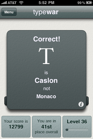
There are some nitpicks to have with the design, but the gameplay is really great. The letters could load faster, or be queued up in some way, but it works well enough to keep me playing. It would be nice to show the right/wrong answers side-by-side on the flip-side when you get one wrong. Also, the difficulty of the questions could be a bit more level; sometimes its like a sans-serif I with no bars on the easier levels… not so easy.
Something Ill keep coming back to, though. Worth a buy.
Some bad moments
Nice idea, but the game pace is too slow! You pass more time waiting the new glyph than playing.
The last time this game was updated was 2010. It really have enjoyed playing it and got pretty high up in the rankings. But now every time I try to log in the game freezes. I dont see an update coming any time soon, so I guess the game is just broken for me now. Really disappointing since this was not a free game.
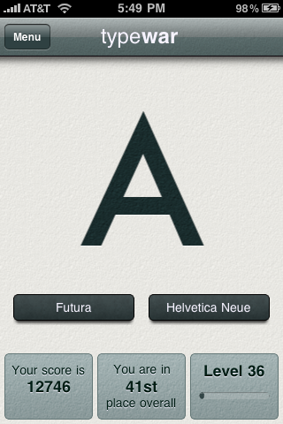
For $2 I expected a little more range of typefaces than what comes installed with Microsoft Office. And yes, I know more typefaces get unlocked as one progresses. Im on level 16 ranked in the top 500 and just got "rewarded" with another awesome MS Office font, the venerable "Georgia". What a thrill.
Also, I defy anyone to honestly differentiate between the capital "I" from Helvetica Neue and Arial. Nor should they have to.
Speed the whole thing up, too. Is it taking so long to load each letter because of the statistics no one looks at? I know you worked hard on writing the code that collects that info, but players would rather move faster to get to the next letter instead. Save the stats for the website.
I REALLY want to be challenged more by this game as typography and fonts in general are something I enjoy immensely. I hope the developer can make this great IDEA for an app into a great app.
Its a fine idea, really -- youre puttering along choosing between Optima and Garamond, Helvetica and Futura, and then Verdana pops up. Verdana? Seriously?
1) no retina display support. Really? This is an app about the beauty of fonts and youre not even taking advantage of THE BEST SCREEN FOR VIEWING FONTS ON EARTH. BY HUMANS. EVER.
2) would like some tips/tutorial about fonts e.g. What is a serif? Maybe a discussion of each font as it is introduced. E.g. Garamond has distinct rounded serifs.
I docked 2.5 stars for no retina display and .5 for no tips. Other than than great concept and decent UI design.
Get back to work!
Wish I had read the reviews before purchasing. It makes no sense that this game does not have retina display support by now... To me, it is just unacceptable.